As an interior designer based in New York City, I’ve worked on countless bathroom renovations for clients, but nothing prepared me for the lessons I learned while redoing my own.
Redesigning my bathroom taught me that even with expert knowledge, practical considerations sometimes take a back seat to aesthetics.
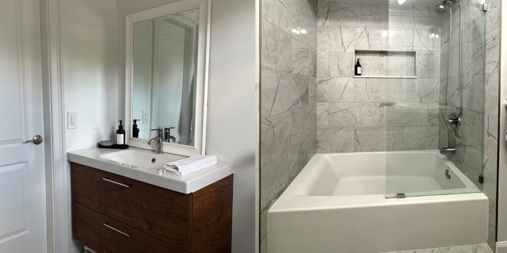
I spent months planning and $13,000 to renovate my bathroom last spring and although it’s gorgeous, I have four big regrets.
Here’s what I’d do differently next time — and what you should know before dropping five figures on your next bathroom remodel.
The built-in shower niche looks good but isn’t practical
I was excited about incorporating a built-in shower niche into my bathroom. It looked incredibly sleek and added a modern touch to the shower area.
However, the reality of using this feature didn’t quite meet my expectations.
The niche, while aesthetically pleasing and minimalistic, turned out to be not spacious enough to accommodate all my toiletries and shower essentials.
Pinterest-worthy bathrooms and hotels fill these niches with cute refillable shampoo bottles to keep them aesthetically pleasing. But I quickly realized my shower routine required way more products that weren’t so cute, but I didn’t want my niche to look like a shelf at T.J. Maxx. In hindsight, I should have considered larger or multiple niches to better suit my needs.
Another issue with the shower niche is maintenance. It needs to be wiped down after each shower to prevent mold buildup. This extra step adds to my cleaning routine, making it more of a hassle than I initially anticipated.
Not adding storage above the toilet was a missed opportunity
When designing my bathroom, I wanted a clutter-free wall above the toilet to maintain a clean and open look. Although this decision was driven by aesthetics, it didn’t account for practicality.
I opted for a two-drawer vanity from Ikea to handle all my storage needs, but it’s not sufficient. The limited storage space has forced me to leave some items out in the open, contradicting my goal of a tidy, minimalist bathroom.
Installing shelves or cabinets above the toilet could have provided much-needed additional storage without compromising the overall design.
The single glass shower panel is beautiful but impractical
The single glass shower panel was another choice that appealed to my design sensibilities. It gave the bathroom a sleek, open feel and looked fantastic. However, it’s not the most practical feature for everyday use.
Cleaning the single glass panel is particularly challenging. To avoid water spots and soap scum, it needs to be wiped down regularly.
The biggest inconvenience, however, is that cleaning it often results in getting wet again after a shower. A full enclosure or even a double panel might’ve been a more practical choice, balancing both form and function.
A deeper tub would’ve been a better investment
A realtor once advised me that having a tub in the bathroom could add more value to my home than a stand-alone shower.
This advice, combined with my love for the occasional bubble bath, led me to include a tub in the remodel. However, I regret opting for a shallow one.
Although the tub is perfect for my once-a-year bubble bath, it’s not deep enough to provide the luxurious soaking experience I had envisioned.
As someone who primarily showers, the shallow tub doesn’t see much use, and when it does, it feels inadequate. A deeper tub would’ve been a better investment, offering a more satisfying soak and potentially increasing the bathroom’s appeal to future buyers.
Overall, consider more than just aesthetics when designing a space
If you’re planning a bathroom renovation, take it from an interior-design expert: Think beyond looks and prioritize how a space will work for you daily.
This way, you can avoid some of the pitfalls I encountered and create a bathroom that’s both beautiful and practical.
Read the full article here


